
[No. 071]
Art

Man & Machine: Log 3
Third checkpoint of the journey so far.
Here’s what I’ve learned about myself:
My workflow starts from a sketch > flat colours > cell shading > painting > photo manipulation
I’m seeing a pattern where I’m merging cell shading and painting as a singular process (creates a blocky and painterly style)
I enjoy using a dark base complemented by high contrast colours
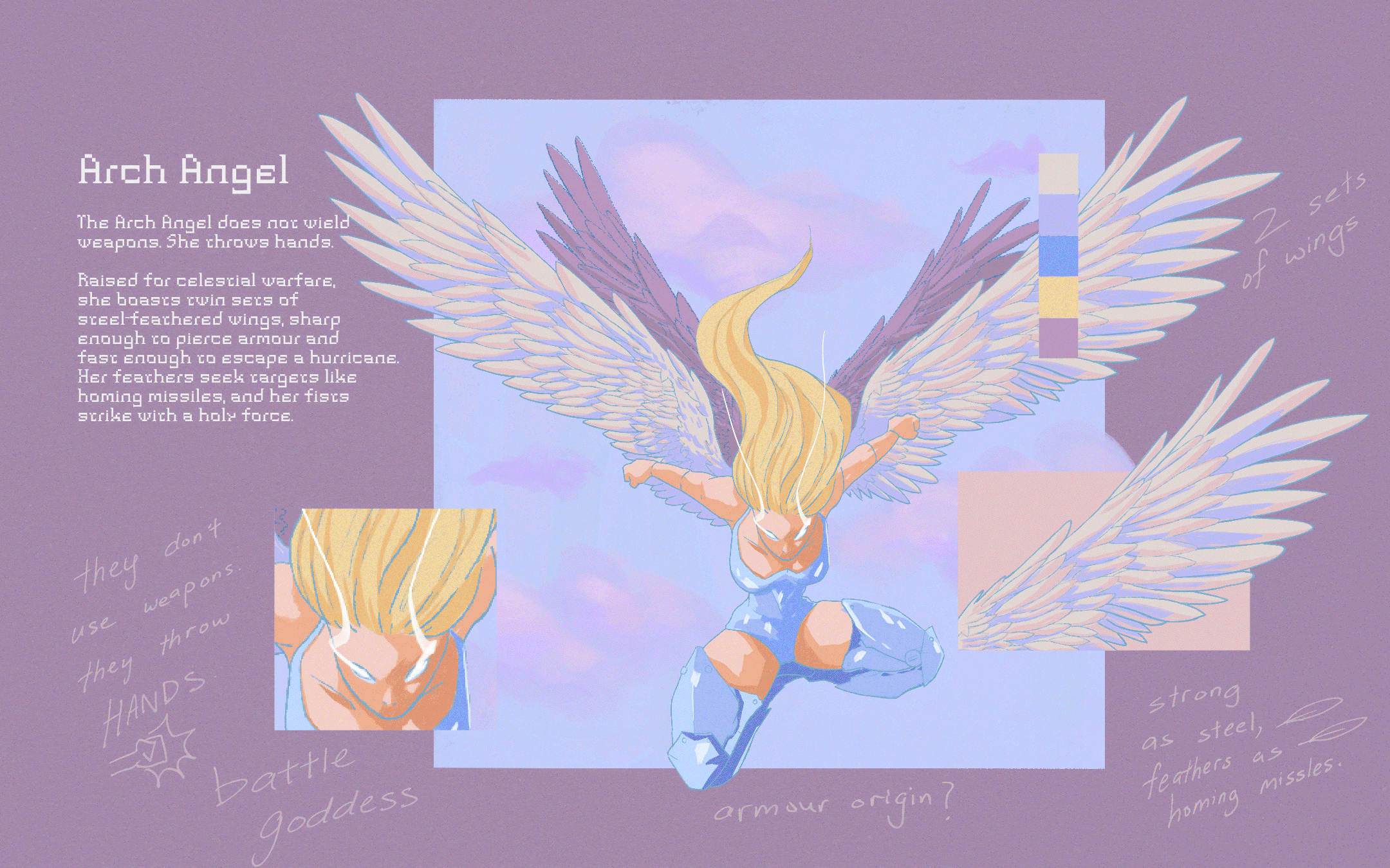
Strong design + vibrant colours = good; strong design + vibrant colours + dynamic movements = even better (Arch Angel and Spidermen are good examples)
Stories between characters started becoming clearer the more I thought about how they would interact with each other (I should write it down)
Arch Angel, Sara Argo and Spidermen had the best line art for the week
Code Proxy is my least favourite design this week because of dull colours, sad composition and underdeveloped context
Sara Argo makes a reappearance since her debut in 2020 and steals the limelight again (most likes)
Queen Fang came out better than expected, and The Librarian flipped a switch in my head when painting
My sketches for the 3rd week, Day 19 - 26
DALL·E meets Midjourney
This week was an interesting AI comparison because I found opportunities to utilise it for client projects.
Pros:
Midjourney generates 2x more design variations faster than DALL·E (sometimes 4x, when systems are delayed)
Using DALL·E to make edits via text before extracting the prompt into Midjourney yielded better variants
Midjourney is by far the most stylised generative AI in comparison to DALL·E and Stable Diffusion, it also has easy to use interfaces which can quickly create new variations, upscale in quality, zoom out and create animations just by clicking buttons.
Midjourney is more explorative in developing backgrounds to fit the character’s design, DALL·E is more reluctant to do so without clear instructions
Cons:
Animation sequences in Midjourney come off choppy, with line art looking wavy and inconsistent between frames (not suitable for professional use)
On Midjourney, artwork sizes are defaulted as squares (1:1) despite being prompted otherwise
There are less spelling errors on Midjourney than DALL·E, but most words are still illegible
Graphic visuals (eg: painterly style of torn human flesh revealing a spider’s anatomy) are not generated
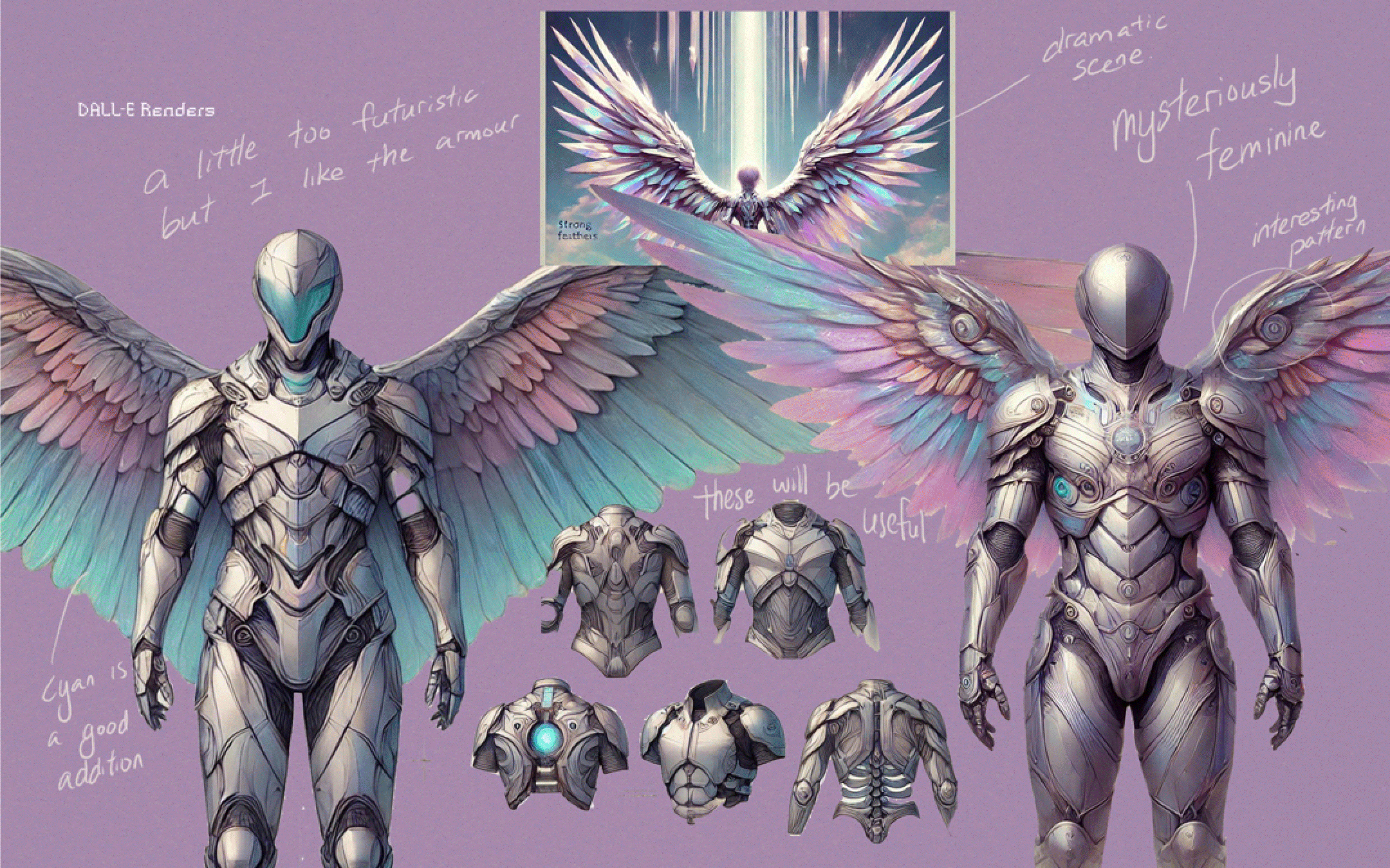
DALL·E and Midjourney’s interpretation of my work based on text generated by ChatGPT + my notes
Week 4
The coming blog will include my last 5 designs for Inktober.
There aren’t any specific changes I’m planning to make, but I intend to experiment more on Midjourney.
Thanks so much for being here!