[No. 040]
Art

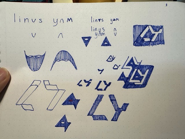
I believe a logo should be like a flag, easily recognisable and simple enough that a 5 year old can draw. I learned that from this TED Talk, Roman Mars (the speaker) is knowledgeable and has an entertaining way of speaking. Looking back at it, I’m seeing that my “flag” had a few shortcomings: fixed shapes, little personality and low symbolism. While it does capture the essence of simplicity, it is now a shell of who I am and has stifled my progress. I tried making changes, but I wasn’t pleased with it.
So, I started redesigning my logo last week. Before I started, I set a few rules:
It will exist in various forms
It will have elements for growth and exploration
It will symbolise my creative capabilities
It will not be boring
Using that as my guideline, I started off with a simple sketch that encompass 2 words: digital warlock. It’s a subtle twist, because “digital wiz” has been over-claimed into obscurity. Besides, warlocks are more underrated and I can get behind that. Here’s the first sketch that kicked things into motion: