[No. 027]
Design

A week left until the end of 2024 and I’m listening to 收斂水 by Soft Lipa while gathering my test designs from this week. I have a bit of a mixed bag going on but I think that’s for the best right now. I believe it will be beneficial to provide myself with a wider variety of options to work with for different content series. That way, it’ll help set the tone in context through design differences.
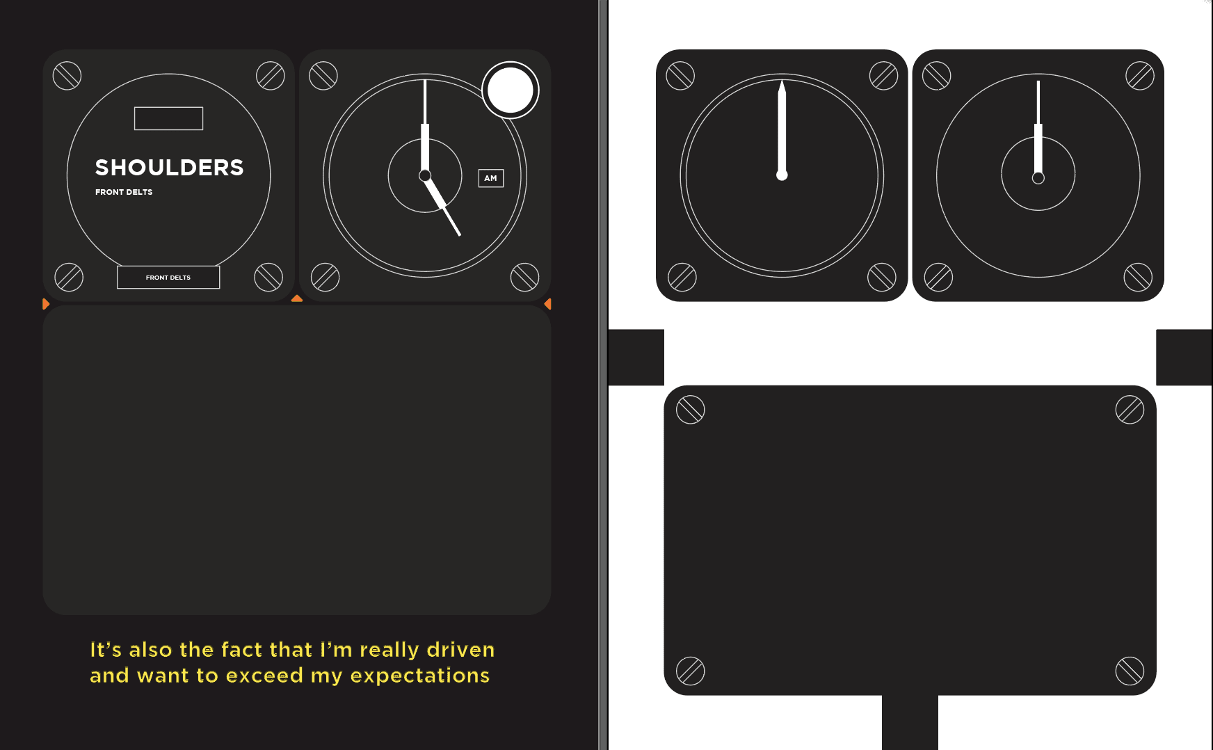
I attribute the inspirations from this carousel to Bell & Ross, brutalism + antireal layouts on Pinterest and Jacktus. I think it’s really interesting that I’ve mimicked these different vibes and how each of them have their own personality. The Bell & Ross inspired design is extremely minimalistic and clean, it says all it needs to with the difference of thickness and consistency of lines.
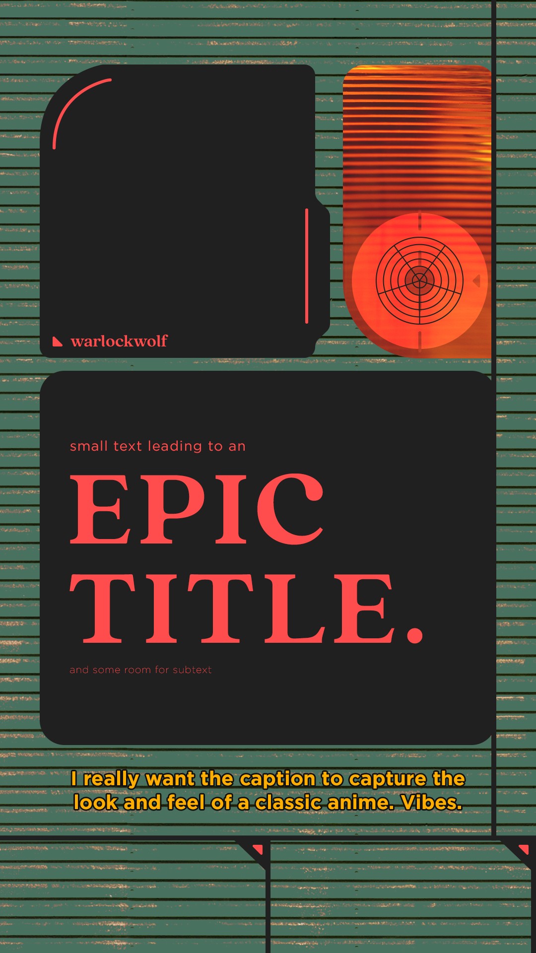
On the other hand, the second design can be hardly themed brutalism or antireal anymore after the changes I made lol. Yet, I find it charming in some ways. The odd colours work unusually well together and there’s something about the green shutter texture which makes it seem like I’m looking at a retro-futuristic military comms device.
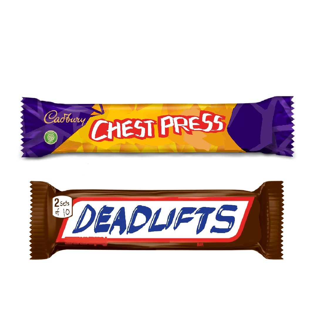
And lastly, pure fun in the art sense in that last image: fitness themed chocolate bars inspired by Jacktus’ approach with everyday goods and ironic statements. I think it has potential to be expanded on. After all, there are so many chocolate bar designs and even more exercises to be introduced!