
LINUS YAM
2025
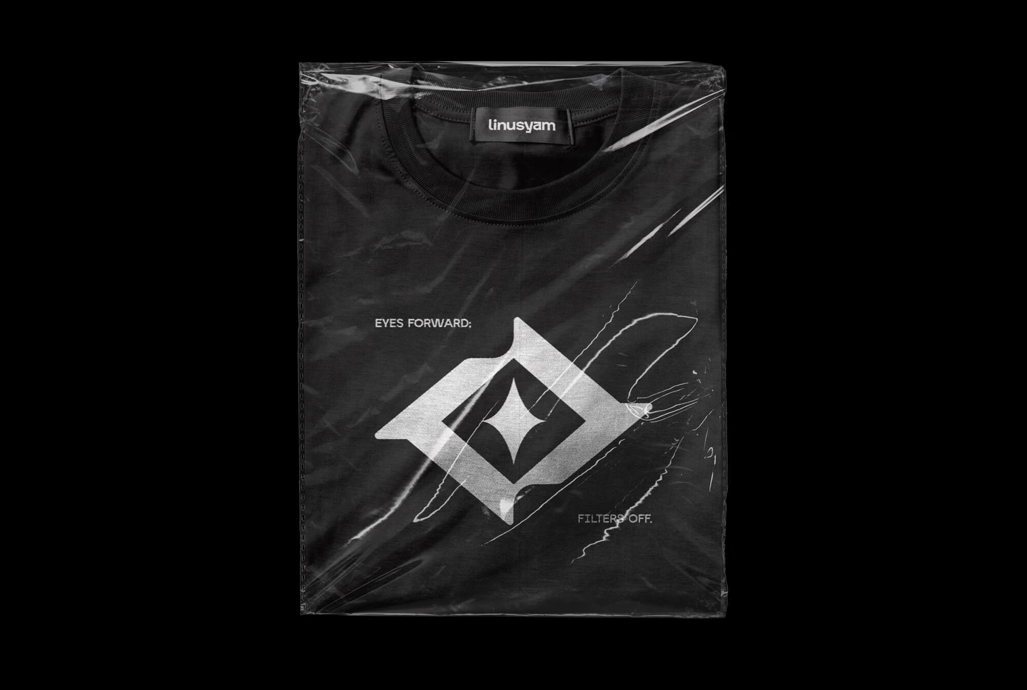
I outgrew my old logo — not from rejection, but evolution. This new identity is a reflection of everything I've learned since: sharper, more intentional, and grounded in the same core that started it all.

DID YOU KNOW?
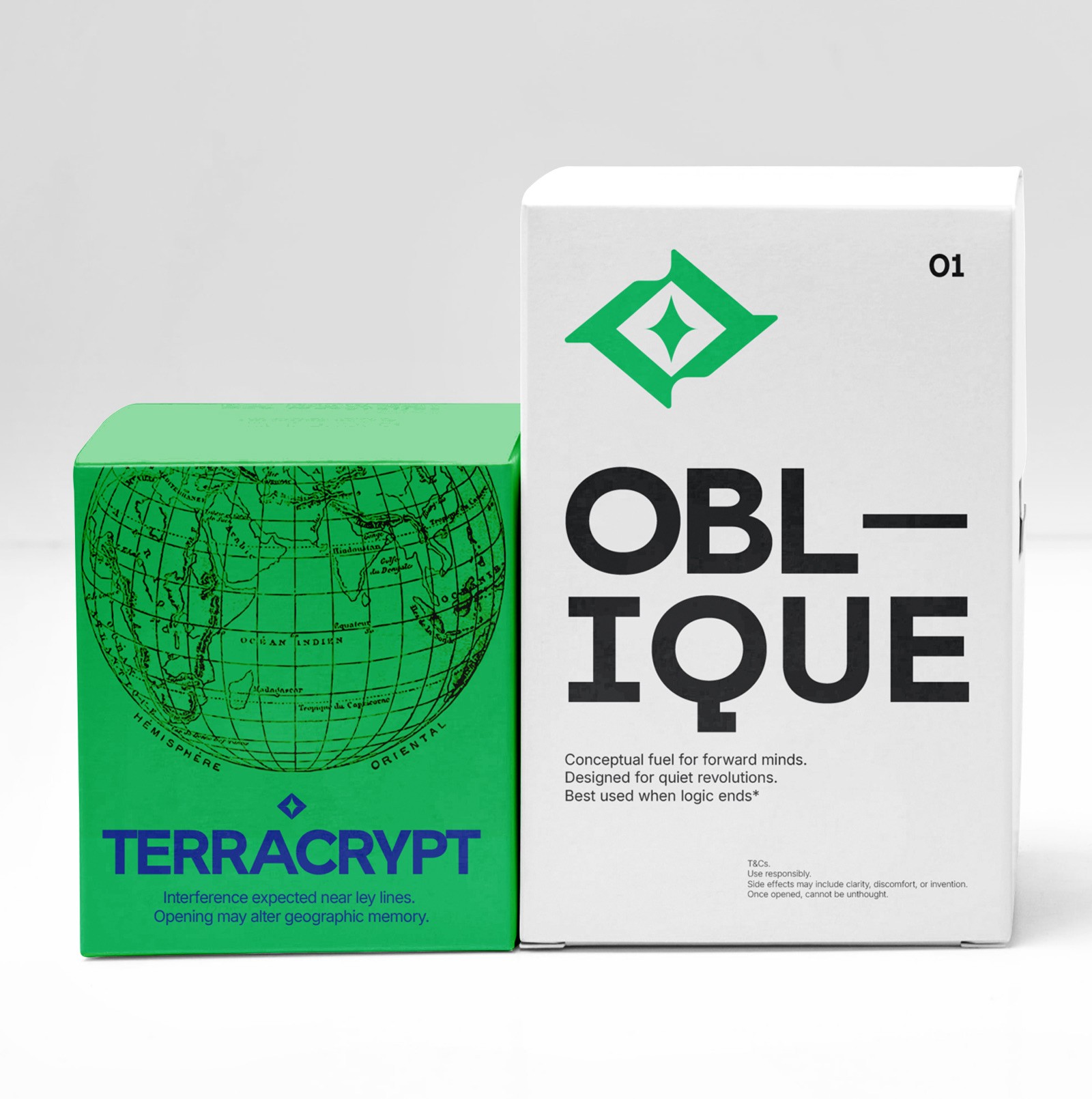
I've always enjoyed abstract logos over wordmarks, there's more room in them to hold meaning without spelling it out. This logo actually started as a single sketch for a side project which evolved into a design system. The colour palette and shapes were inspired by antirealism: sharper, more intentional and less literal than my earlier work.
4th
30+
CHALLENGE
Obstacles
The biggest one was honouring the spirit of my old logos while future-proofing the system for longevity. I wanted to design something built to grow with me. On top of that, I want it to reflect who I am now, and who I'm becoming. It's a reminder of where I've been and a signal of where I'm headed.
STRATEGIES
& Solutions
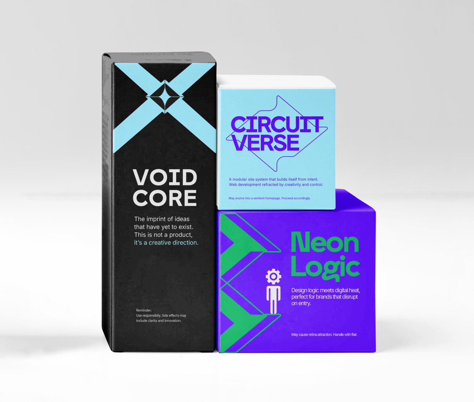
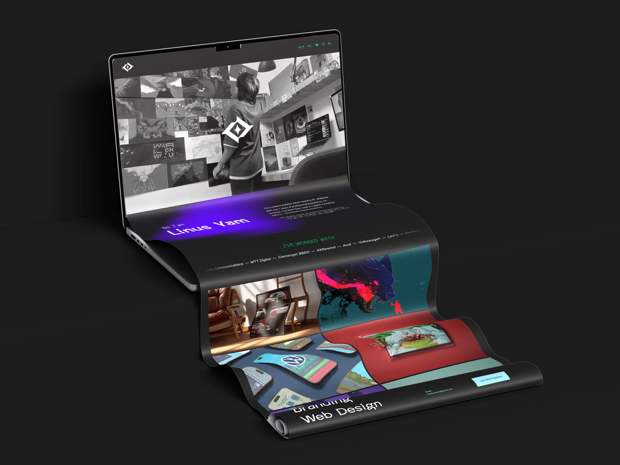
I treated my own brand the way I'd treat my clients: understanding what the old logo was communicating alongside its goal and purpose. From there I built a modular system designed for evolution, not a fixed endpoint, and dug deep to answer the big questions: why does it need to exist, what it needs to do, and who is it really for.
CREDITS
Special Thanks
Let’s work on something great.
Brand identity & visual systems
Web design & development
Art direction & creative strategy
Projects delivered
Linus Yam
No pitch, no pressure.
Tell me what you’re working on and I’ll get back to you.