[No. 085]
Fitness

I’ve been to quite a number of gyms over the years, and what I’ve noticed is that there is always a vending machine.
The size, colour and brands vary but they often sell the same consumables. Y’know, protein shakes, hydration drinks and healthy snacks.
It’s always the same few brands: Muscle Milk, C4 preworkout, Gatorade, etc. They’ve definitely earned their place, but just like Spotify’s Top 50, the popular selections become predictable. And eventually, boring.
Of course, the Taylor Swift of protein bars is widely accepted but…
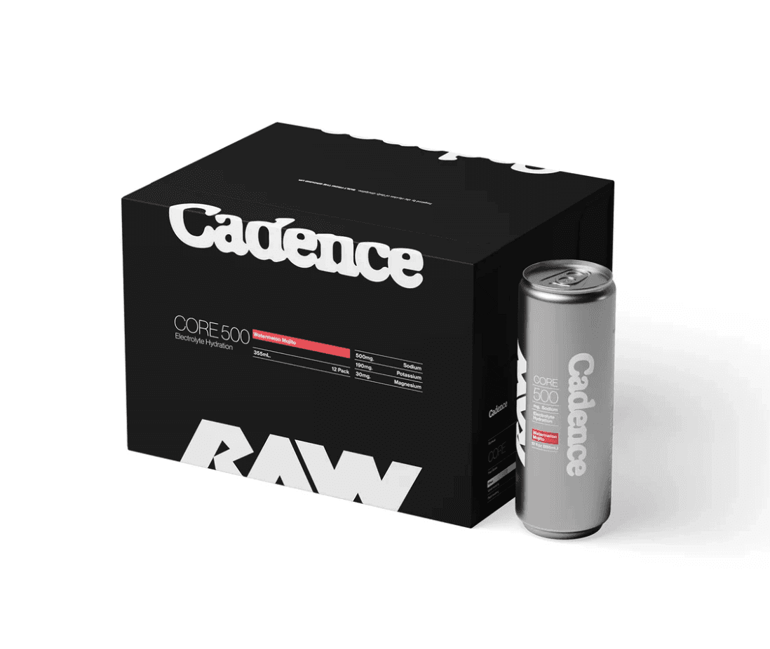
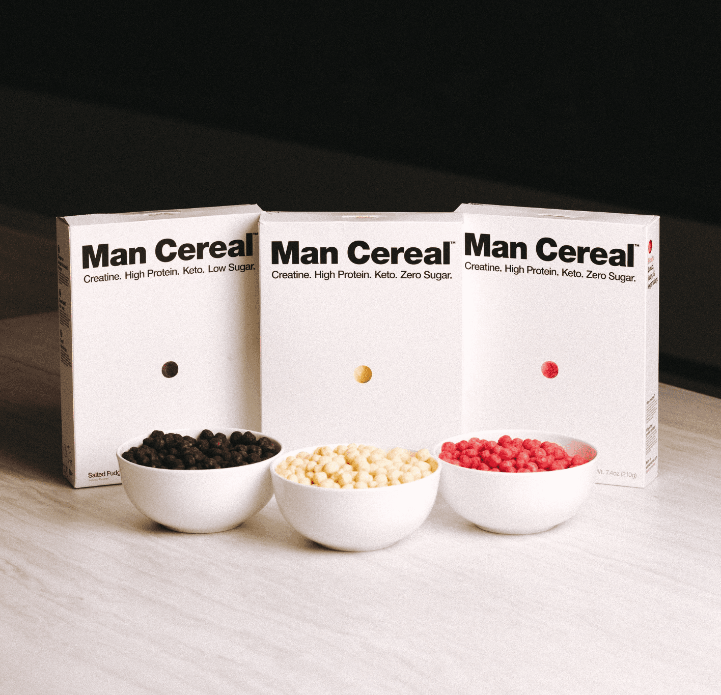
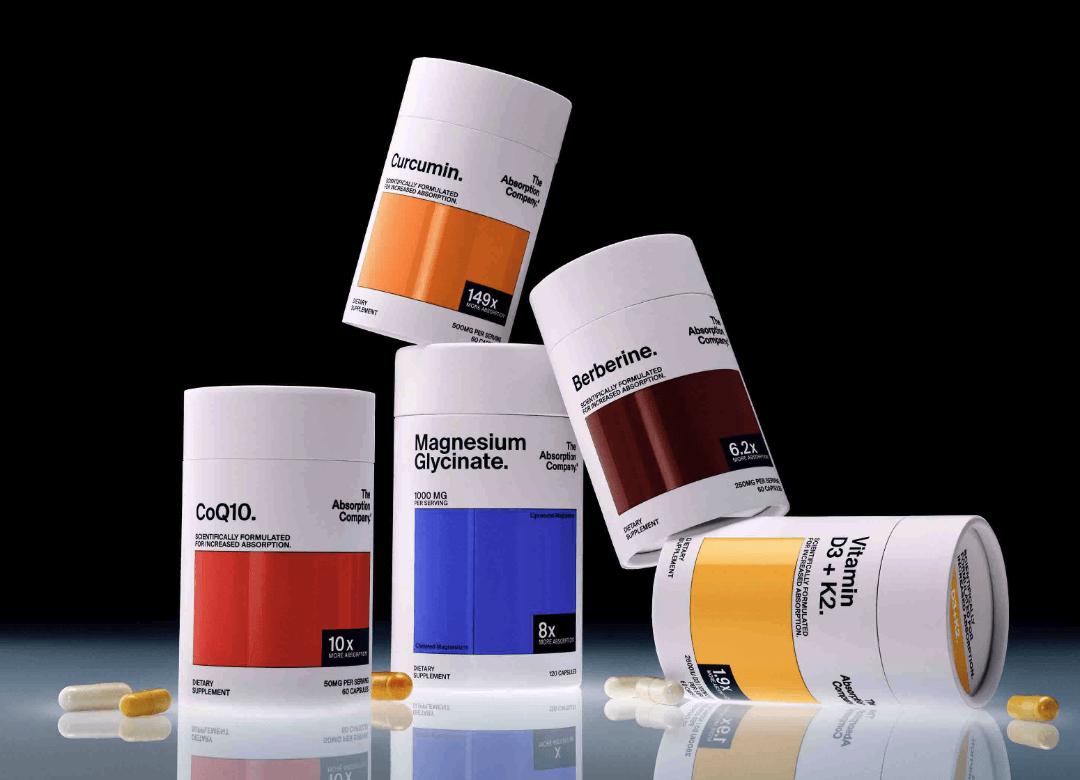
It made me curious about other healthy products in the market so I spent a Saturday afternoon looking for the indie music equivalent of healthy snacks. Some interesting ones I’ve found include Cadence, Man Cereal and The Absorption Company. Nutritional values aside, I’m mostly observing the brand from a visual perspective so it was captivating to study the minimalistic design of these brands. Essentially, it stands out because of 3 simple things:
1. Intentional typography
There seems to be a no-fluff agreement between the brands. Words are used to communicate facts in a utilitarian design that are similar to pill bottles. It’s like taking your daily dose of medicine, but in a fun, casual fitness way.
2. Contrast through size + colours
For Cadence, you see it in the boldness of their fonts which take up most of the space. For Man Cereal, it’s the charm of a singular cereal emphasised by the negative space. For The Absorption Company, it’s the giant colour blocks that help identify the contents.
3. Tidy compositions (with a flashy surprise)
While each brand has embraced minimalism, they’ve approached copy differently. It’s the little things that add up, and you’ll see this in the brand elements which are centre-aligned for Cadence, text elements that are justified for Man Cereal and product details which are right-aligned for The Absorption Company.
On the digital side of things, they share clean, minimalistic design and are all hosted on Shopify. It makes sense since all of them are product-driven but I found this to be an insightful exercise studying their brand cohesiveness.
Don’t just take my word for it, feel free to check out their sites below. No, I’m not their salesman – I just think good designs should be appreciated.
Cadence
Man Cereal (“Add some balls to your breakfast” is pretty clever)
The Absorption Company