
[No. 099]
Design
web design, framer, process

Week 3 of rebuilding my website on Framer
Comparing my progress to previous builds, I am noticeably faster and more decisive with my design process. Part of why this is true is because my past selves created a flexible visual system and steady file structures. The visual language is within a PDF which is replicable as a style sheet, while years of past works and passion projects have been neatly organised.
The effort was hard to justify before, because I like establishing a few things whenever I build a new website:
Reusable pages (for coherence and efficiency during handoffs)
A filing system to organise relevant assets for diff projects (for ease of reference and future exports)
A flexible style sheet that can grow alongside the business (for growth and adaptations)
All of which has been over-simplified in Squarespace, and I’ve outgrown its system. What used to feel fast and convenient has grown into a thorn in the last year. Unresponsive breakpoints, fixed layouts and limited styling options have become impossible to ignore as a designer.
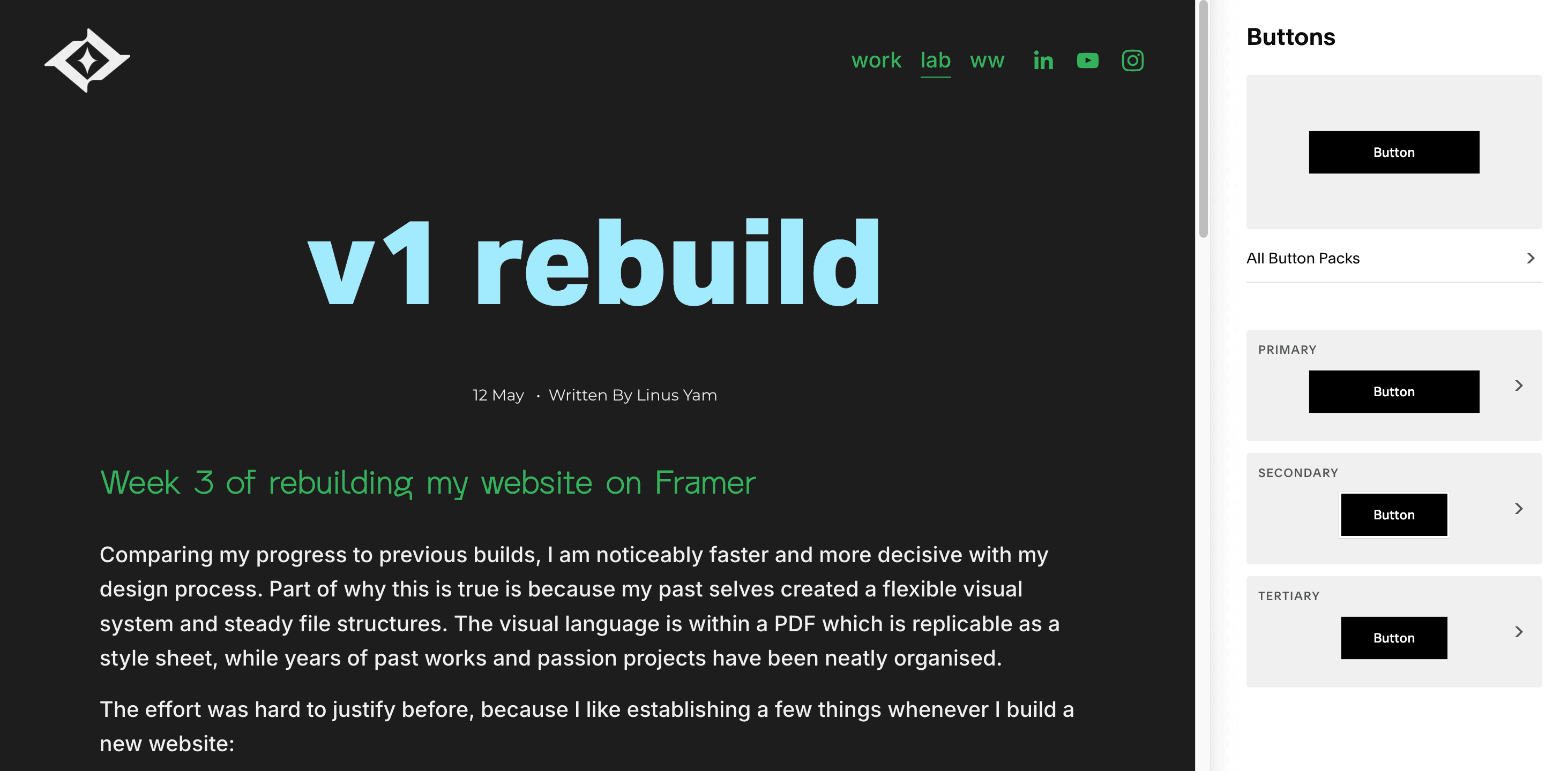
Quick example, have a look at the difference between the button customisation on Squarespace (left) vs Framer (right).

And so, Framer became the natural solution when I realised it solves these issues in 3 parts.
The CMS System, Dynamic Content & Components
It’s amazing how seamless they’ve made the experience. Everything works together.
First off, the CMS is modular. What that means is that you can customise the variables (visuals, text fields, tags, sequences, links, and more). It’s still taking some time for me to fully utilise it, but it blew my mind to learn about this because a) I’m a sucker for sleek systems and b) imagine the convenience of testing new designs from a unified input.
Here’s what the CMS look like side by side, left being Squarespace and right being Framer.


It’s called Dynamic Content on Framer, and it’s exactly how it sounds. If you make a change in the CMS, it is automatically reflected across relevant pages as long as its linked correctly. To achieve the same goal on Squarespace, you’d have to find all the relevant pages before reuploading and editing every variable. Don’t get me started on changing the layout because you’d have to duplicate that section (or worse, the entire page) to keep things in order.
In short, the juice isn’t worth the squeeze.
It’s the same thing with the styling functions. It always bothered me how Squarespace capped their system at 3 button styles and and 4 colours. WHY WON’T YOU LET ME USE MORE COLOURS?!
That said, It’s been frustrating to introduce different designs to my current website because of these limitations, especially because I am a pretty experimental creative. I like having the space to grow and test my thoughts. For these reasons, I appreciate Framer’s Component system.
I don’t have it entirely figured out yet, but I’ve already created 6 buttons. 3 variations for each desktop and mobile, and some of them even have their own hover effect. From what I’ve learned, there are other ways to utilise this function, like building custom sections, navbars and footers – which can become draggable assets whenever you need them.
v1 by end of week
A personal goal of mine is to soft launch the website by the end of this week. It’ll definitely be one of the fastest website rebuilds I’ve accomplished (<3 weeks). I’m sure it’ll have its flaws, but I’d rather see it exist as an imperfect draft than a perfect idea.
A little over half a year ago, I remember thinking to myself: “I can’t wait for my Squarespace subscription to expire so I can rebuild it here.” Now that we’re here, I’m so excited to bring it to life. Just gotta keep moving.