
[No. 106]
design

Lobo means Wolf (in Spanish)
I spent my weekend experimenting with LOBOLAB. If you didn't know, I've been designing some micrographics for the last month related to it and posted them to my socials – here's an example.
I didn't think much of it, it started off as a way to stretch my design logic beyond clients' work. It's been a fun way to build a brand language with absolute freedom and zero backlash – apart from meeting my own standards. Here's a peek into my Figma file:
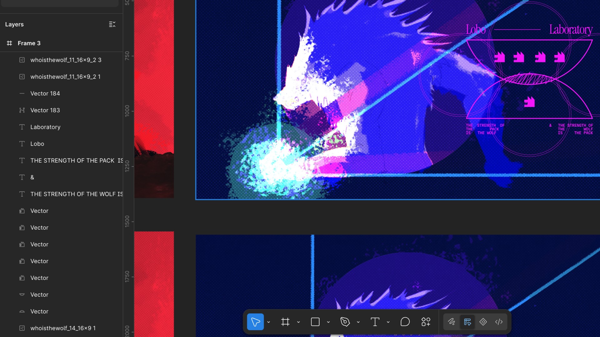
To add some context, I had the idea to integrate my 2024 Inktober project, Wolftober, as part of LOBOLAB (I'll upload it soon). It's a simple concept but it influenced the brand identity and design language so quickly that colour and composition fell into place naturally.
Here's another example:
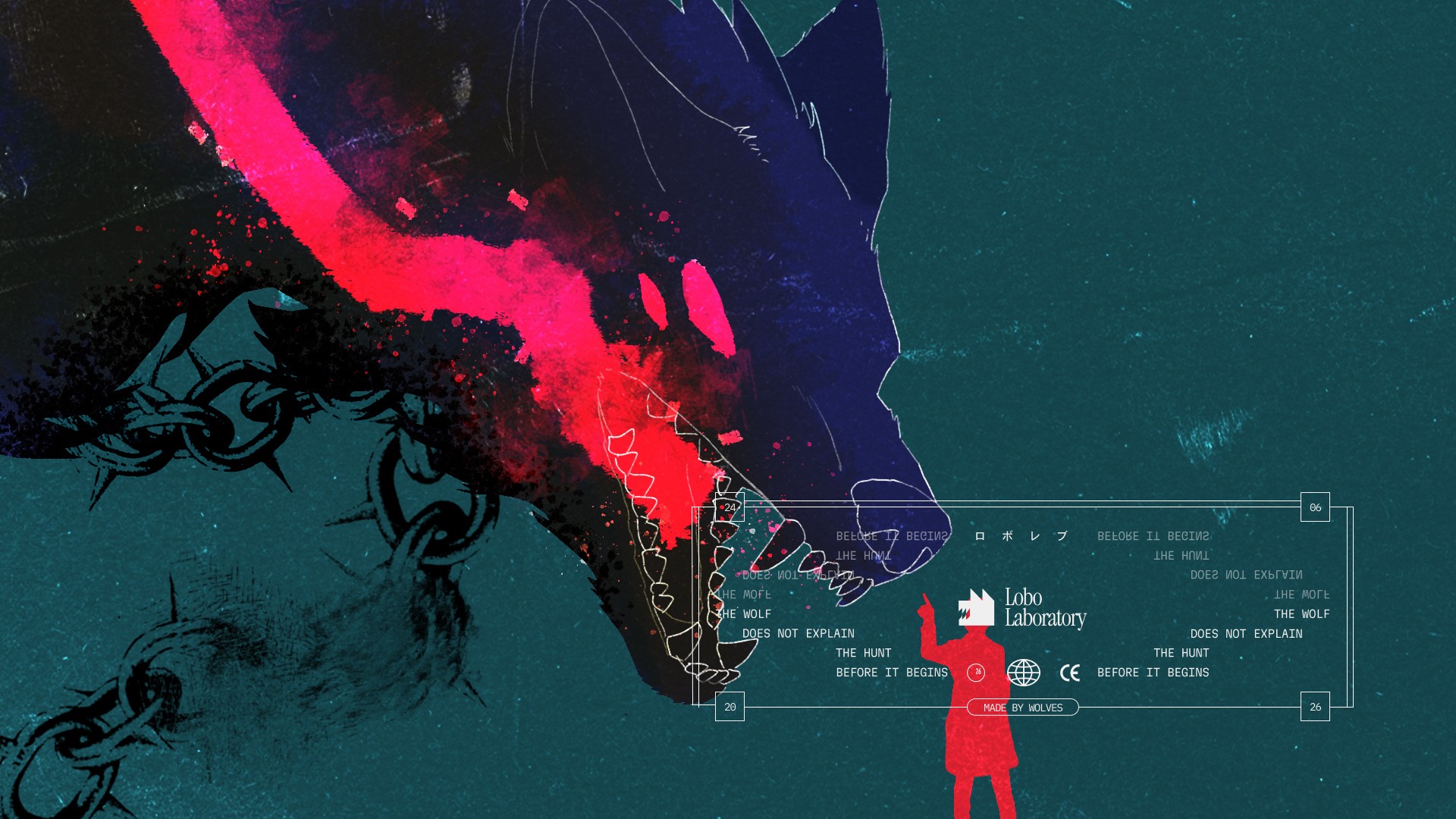
While the Wolftober artwork set the mood, the design language behind LOBOLAB added utility and context. By midnight, I was looking at 20 newly adapted visuals. Some of which were duds, but most of which I intend to share in good time.
The old me would have been content to come this far, but he's dead and gone. I'm going to take this a step further, because working with founders have made me realise that beautiful concepts are truly valuable when it can drive behaviour, solve a problem, or spark change. A good idea means nothing without execution, so expect more updates on this soon.
Note to Self
So far, I've created 2 reels explaining this process on the project but they just aren't doing well despite putting in more effort into designing, editing, and voice recording.
I find it strange that a 20s nonchalant video of me lifting weights with no context has far higher engagement. It might be too soon to judge my new approach until I make some adjustments and test things out again.
That's all I wanted to get off my chest for now.
Either way, I'll figure it out.